Creator: Enrico Tartarotti · Published: 2026-07-31 · Length: 13:39 · Watch on YouTube
Every piece of hardware you touch feels "solid" or feels "cheap" for reasons almost nobody gets to see. — from the video description
1) Detailed outline
[0:00] The engineering of a lid (AirPods case)
- Opening the AirPods case is "the most successful fidget toy ever built," happening billions of times a day.
- Problem 1: the lid has to stay shut so the earbuds don't fall out. A single magnet in the front keeps it closed, but then the lid just flops open loosely, which blocks the earbuds and doesn't feel like a premium Apple product.
- Goal: any lid position should snap either fully open or fully closed, with a cutoff angle that makes it neither too easy nor too hard to open or close.
- Solution: four magnets hidden under the plastic. The two in the front attract each other and the two in the back repel each other.
- Engineers had to calculate how the attracting and repelling forces change with lid angle, size the magnet surfaces so the forces balance, and place the point where the two force curves cross. That crossing is the cutoff where the lid either stays open or snaps shut.
- This isn't a secret: the chart is on page 33 of Apple's patent for the case.
- Thesis: the feeling that a product "just feels good" or "feels solid" isn't random. It comes from a lot of hidden design and engineering, built on four building blocks of physical products. (The description calls them five; the narration counts four.)
[1:24] Building block 1: The science of curves
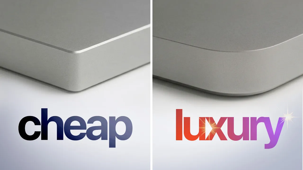
- Quiz: which of two corners belongs to a premium product? Most people pick the same one, and there's a reason.
- Nearly every product has rounded corners. Even "sharp" edges, like the frame of Enrico's Pixel 9, are chamfered, because a true sharp edge would be painful to hold. In surface-continuity terms, a chamfer is G0: the edge is simply cut off.
- For bigger rounding you add a circular arc, which is a G1 curve. Curvature is zero on the flat side, jumps suddenly to a constant value around the arc, then drops straight back to zero.
- The MacBook Pro uses a G2 curve: curvature ramps up and back down smoothly along the corner, which is part of why it feels premium.
- G3 goes further, so even the curvature graph has no corners. It shows up in car free-form surfaces and in the "blobby" tech of the early 2000s.
- In any CAD program you can pick the continuity you want; it's just math. Because the differences show up mostly in reflections, CAD tools offer zebra mode (zebra analysis) to spot non-continuous surfaces and see how light moves across a corner.
- So design isn't the hard part; cost is. G0 and G1 are cheap to manufacture, and budget brands won't pay for a fraction of a millimeter of better rounding, which is exactly what makes them look cheap.
- Apple (Steve Jobs, Jony Ive and the "entire Apple gang") is obsessive enough to spend millions making every product's G2 corners match.
- Not only Apple: the Teenage Engineering TP-7 uses G2 curves on big corners and chamfered edges that catch a line of light, almost like an accent on the keys.
- In software this becomes the squircle, the shape between a circle and a square used for iOS app icons. Figma lets you set corner smoothing when rounding a corner (the math is "a whole separate video"), and there's even a Chrome extension that turns every rounded corner in the browser into a squircle.
- The description adds that the math behind every curved product dates to Citroën in 1959 and was named after the wrong engineer (a reference to Bézier curves). This isn't covered in the narration.
[4:38] Building block 2: Tactile button feedback
- The most basic button is two pieces of metal that close a circuit when they touch. It works, but it feels like nothing.
- Force–travel chart: how far you press against how hard the button pushes back. For the bare contact the line is flat, and mushy buttons look much the same, with nothing pushing back.
- Fix: the metal dome, a tiny steel dish that resists your finger until it suddenly buckles. On the chart the force climbs, then drops off a cliff at the collapse.
- Most people think the click sound makes a button feel good, but it's really that force cliff. Phone power buttons, TV remotes and car keys all have a dome like this inside.
- Tactile ratio: how much the force falls, divided by the peak force.
- 0% gives a mushy button with no feedback.
- 100% means the dome never pushes back up, so the button stays down.
- Manufacturers literally sell positions on this scale.
- Trade-off: a higher ratio and force feel better but bend the steel more. Enrico's example: a dome rated at 180 g of click force lasts about 5 million presses, while a much nicer 300 g dome is rated for only about 10,000. Picking a button means balancing feel, cost and durability.
- Butterfly keyboard (2015–2019): to make the thinnest pro laptops ever, Apple redesigned every key's mechanism to cut travel roughly in half.
- Typing felt odd and less tactile because the keys barely moved.
- With so little gap, a crumb or speck of dust could kill a key. Letters repeated or appeared on their own, and a software update couldn't fix it.
- Apple launched a repair program for nearly every butterfly Mac and paid $50 million to settle a class action. In 2019 it brought back a regular keyboard.
[7:31] Sponsor segment: Cursor
- Hardware is hard, but building software is getting easier. Enrico uses Cursor to build large parts of Flask, his video feedback tool.
- Plugins/integrations: while debugging a customer's video-upload failure, Cursor checked his database through a plugin, pulled Vercel logs, and combined both to fix the bug. Figma is connected for icons and wireframes.
- Cloud execution: with his computer off, he can fix issues from his phone while Cursor spins up a full Linux VM with a GUI to test the app and even record videos of the fix.
- Because Cursor is a real IDE, he can also hand-tweak Tailwind classes to dial in a component faster than an AI would.
[8:43] Building block 3: Materials and perception
- PlayStation 5: the first time he saw one, it looked cheap before he even touched it. The cause is the big glossy plastic centerpiece.
- Injection molding (hot plastic pushed into a mold) is cheap and can make almost any shape, but the plastic cools at different rates in different spots. On a large glossy part every imperfection shows. The band looked sharp in renders but not in real life. A matte mock-up makes the PS5 look far more premium.
- Materials also carry meaning: the Game Boy Color and original iMac stand for the late-'90s and early-2000s transparent plastic trend, which showed the components and made tech feel "naked," accessible and open. Rendered in aluminum, they look wrong, because they're so tied to their material.
- Why metal feels premium: his plastic Game Boy Advance SP and his roughly $1,500 aluminum Fujifilm X100V look and feel nearly the same in color, reflections and matte finish. The difference is that metal feels cold. That's not actual temperature but thermal effusivity, how much heat a material pulls from your hand. Aluminum draws about 30 times more heat than plastic.
[10:48] Building block 4: Fusing hardware and software
- Small examples on the Pixel: the on-screen volume control animates out of the physical volume buttons, and the under-display fingerprint unlock animation seems to come out of your thumb.
- The most magical experiences fuse hardware and software, and companies don't do it enough.
- Switch 2 concept: a designer friend, Brecht, made a pre-launch mock-up where docking the Switch plays a Mario-pipe animation that moves the picture from the handheld screen to the TV, matching the product's look and its physical interaction.
- Teenage Engineering OP-1: a synth used by producers on famous songs. Hardware and software are one experience. The interface is built around four colored knobs. Every effect and synth maps its parameters to them, the knob colors show up on screen, and what would be a dense DAW panel becomes playful and tactile, like shaping sound with your hands.
- TP-7 recorder: its big central disc spins like a vinyl record during playback and lets you scrub. To sell the illusion, it digitally bends the pitch the way touching a real record would, so you can scratch on a digital device.
- This is easiest when you control both hardware and software, which is why so many examples are from Apple. The Dynamic Island turns a hardware limitation, the camera cutout, into a useful software element.
- Software-only makers can still design around the hardware. The Hey Clicky AI assistant ("an AI buddy that lives on your Mac") lives in the MacBook notch, and another app he names "Amy" (as heard) also uses the notch as its main element.
[13:02] Outro: notifications tease
- Notifications are "probably the most powerful piece of the tech you use every day," hiding a lot of design and engineering and able to shape the behavior of millions. He points to his separate video on notifications.
Key takeaways
- "Premium feel" comes from engineered details: force curves, curvature continuity, material physics and hardware-software coherence.
- Most of those details are cost trade-offs, not design mysteries. Cheap products usually look cheap because someone skipped a small, expensive step.
- Tactile feel always trades against durability and thickness, and the butterfly keyboard shows what happens when thinness wins.
- The strongest experiences come from treating hardware and software as one product, and even software-only teams can design around the device's physical features.
2) Things mentioned
Products and devices
| Item | Notes |
|---|---|
| Apple AirPods case | Four-magnet lid (two attracting, two repelling) that snaps open or shut. Force chart on page 33 of Apple's patent. |
| Google Pixel 9 | Chamfered (G0) frame edge, volume-control animation, under-display fingerprint unlock animation. |
| Apple MacBook Pro | G2 corner curvature. 2015–2019 models used the butterfly keyboard. |
| Apple butterfly keyboard | Roughly half the key travel. Dust failures, repair program, $50M class-action settlement, dropped in 2019. |
| Teenage Engineering TP-7 | Field recorder with G2 corners, chamfered light-catching edges, and a spinning disc that scrubs and scratches like vinyl. |
| Teenage Engineering OP-1 | Synthesizer whose UI is built around four colored knobs. |
| Sony PlayStation 5 | Large glossy injection-molded band shows flaws and looks cheap. Matte mock-up looks premium. |
| Nintendo Game Boy Color | Icon of the transparent-plastic era. |
| Apple iMac G3 (original iMac) | Translucent plastic design from the late '90s. |
| Nintendo Game Boy Advance SP | Enrico's plastic handheld, compared with a metal camera. |
| Fujifilm X100V | His roughly $1,500 aluminum compact camera. |
| Nintendo Switch 2 | Subject of Brecht's pre-launch docking animation concept (Mario pipe). |
| iPhone Dynamic Island | Camera cutout turned into a functional software element. |
| iOS app icons | Squircle shape. |
| TV remotes, car keys, phone power buttons | Everyday metal-dome buttons. |
Software, tools and companies
- Cursor (sponsor): AI code editor with plugins (database, Vercel, Figma), cloud agents on a Linux VM with a GUI, and full IDE editing.
- Flask (flask.do): Enrico's video feedback tool, used to make this video.
- Figma: corner-smoothing control for squircle-style corners.
- Tailwind CSS: utility classes he tweaks by hand.
- Vercel: hosting/logs used while debugging Flask uploads.
- CAD software with zebra mode / zebra analysis for surface continuity.
- A Chrome extension that turns rounded corners into squircles (not named on screen in the frames checked).
- Hey Clicky (heyclicky.com): Mac AI assistant that lives in the notch.
- "Amy" (as heard): another Mac notch app. The name wasn't verified on screen.
- DAW (digital audio workstation): the dense interface the OP-1 avoids.
- Companies: Apple, Google, Sony, Nintendo, Teenage Engineering, Fujifilm. From the description only: Citroën, Braun, ThinkPad, Leica.
Design and engineering concepts
- Surface continuity G0/G1/G2/G3: chamfer, circular fillet, curvature-continuous corner, and curvature-rate-continuous surface.
- Squircle / corner smoothing.
- Bézier curves: the description notes the 1959 Citroën origin and the naming credited to the "wrong engineer."
- Force–travel curve, metal (snap) dome, tactile ratio (force drop ÷ peak force), actuation force (grams) against lifecycle (presses).
- Key travel against thinness.
- Injection molding and visible surface flaws on glossy parts. Matte vs. glossy finishes.
- Thermal effusivity: why metal feels cold and premium (aluminum is about 30 times plastic).
- Material association (the transparent-plastic era).
- Hardware–software fusion: animations tied to physical controls, the notch and Dynamic Island as UI.
- Design patents (Apple's AirPods case patent).
3) Biographies
Enrico Tartarotti (host, writer, producer)
Italian-born tech creator and designer behind the YouTube channel Enrico Tartarotti, which goes behind the scenes of everyday tech products in designed video essays on UX, product and industrial design, and tech culture. He builds Flask (flask.do), a video collaboration and feedback tool that he uses to make the videos, and he handles sponsorships through Rakugo Media. Credits for this video: written by Enrico Tartarotti, produced by Enrico and Bartek Malinowski, edited by Seequence. Find him on X as @EnriTarta and on Instagram as @enritarta.
People referenced
- Steve Jobs: Apple co-founder and CEO, known for his fixation on design details. Cited as the kind of person who would spend millions to make product corners match.
- Jony Ive: Apple's longtime industrial designer and later Chief Design Officer (until 2019), behind the iMac, iPod, iPhone and MacBook designs. He later co-founded the design firm LoveFrom.
- Brecht: designer and creator friend of Enrico's who made the Switch 2 docking-animation concept. His full name isn't given in the video.
- Bartek Malinowski: Enrico's producer and co-producer of the video.
- Description only, not in the narration: Dieter Rams (Braun's legendary industrial designer, known for the "ten principles of good design"); and the Bézier story, where Paul de Casteljau developed the curve math at Citroën around 1959 but the curves were named after Pierre Bézier, who popularized them at Renault.